Sans Serif Google Variable Fonts
A invaluable resource for web developers, Google fonts provides wonderful fonts for free, so here are some of my favourite sans-serif variable fonts to try in your websites and applications.
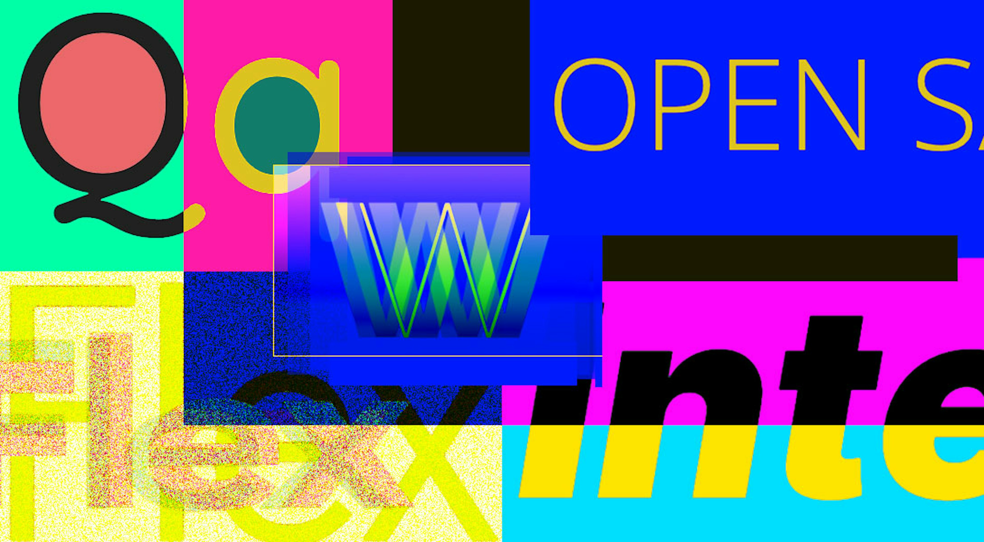
Google Fonts stepped into the variable fonts world updating their API a few years ago and since then their catalogue of variable fonts has grown considerably. So with a lot to choose from here are some great Sans-Serif options to try.
Open Sans

Open Sans is a sans serif typeface designed by Steve Matteson, a popular font for body and headings, Open Sans has been available on Google Fonts for quite some time. In March 2021, the family was updated to a variable font family. It's a versatile font, and a safe bet if you're not sure what to go with.
Open Sans has been optimised for print, web, and mobile interfaces, and has excellent legibility characteristics, so it's a great font to choose if you want something you can use across all your platforms or other mediums.
Get Open Sans - Free, licensed under OFL.
Work Sans

Work Sans is another great staple font, often a go to for people looking for an easy to read, clean sans-serif look. Updated to a variable font in 2020, it's regular range at medium sizes has been optimised for on-screen text usage while the fonts closer to the extreme weights are designed more for display use both on the web and in print. Overall, features are simplified and optimised for screen resolutions; for example, diacritic marks are larger than how they would be in print.
Much like Open sans it's a safe bet and something you can utilise across mediums.
Get Work Sans - Free, licensed under OFL.
Inter

Unlike the previous two fonts, Inter has been designed and optimised for computer screens it features a tall x-height to aid in readability of mixed-case and lower-case text.
Several OpenType features are provided as well, like contextual alternates that adjusts punctuation depending on the shape of surrounding glyphs, slashed zero for when you need to disambiguate "0" from "o", tabular numbers, etc. This makes it particularly useful for web applications representing a lot of data. This is actually a font I use day to day in my day job!
You can check out the Inter project is led by Rasmus Andersson on github.com/rsms/inter
If you're using this from Github instead of Google, I highly recommend subsetting this font as the base font is large and has a lot of features you may never use.
Get Inter - Free, licensed under OFL.
Roboto Flex
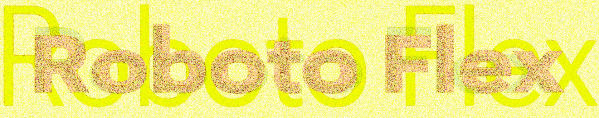
It would be remiss of me to fail to mention Roboto Flex given that it's the font I use on this very website! It has a very long list of contributors and a lot of work has gone into Roboto Flex to make it suitable for working on the web in the varied screen sizes, uses and applications.
It is an upgrade to the original Roboto and is a much more impressive typeface (can I say that?). According to the Google Fonts website, "[it was designed] with the constant switching between devices, resizing browsers, and spreading our viewports across multiple screens in mind."
Google actually commissioned Font Bureau to do this work to Roboto with a "special emphasis on large-screen capabilities".
Roboto flex has an extreme range of weights, grades, widths and optical sizes. It allows for a lot of variation, control and flexibility which of course I love because of its ability to finesse and fine tune your designs without losing that cohesiveness (and of course without needing multiple fonts).
When I wrote this post Googled haf served Roboto Flex 73.4million times. So it's certainly a popular choice. I hope that you're all making the most of it's incredible features.
Get Roboto Flex - Free, licensed under OFL.
Quicksand
This list has quickly turned into "Fonts Mandy has used in things" list. I had to include Quicksand in my list as I've actually used it a couple of times in my presentations!
I love this font because it's a little quirky without being too over the top. I'm a huge fan of the out there variable font designs, but sometimes you want something with a little bit of character but without losing the legibility. And that is quicksand's main benefit, it was specifically designed for display purposes but kept legible enough to use in small sizes as well.
Get Quicksand - Free, licensed under OFL.
There are so many great sans-serif Google fonts I'll have to do a part two. Stay tuned.