Fonts with a large weight range
Fonts that have a large weight range offer a lot of opportunities for creating impactful typography, animations and improved legibility.
Variable fonts with a large weight range
Variable font with a very large weight range can provide more flexibility in designs and experiments. Having a large weight range can give you the capabilities of representing text that is very bold as well as very thin without the need for multiple fonts and maintain the cohesion you get from using the same typeface.
This is not an extensive list, there are a lot of really great variable fonts with a large weight range, these are simply my favourites (at least for now).
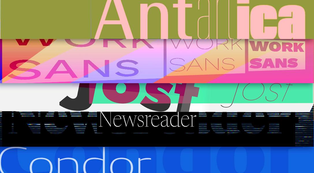
Condor

Condor is probably my favourite within my "weight" category (I don't like to say I have favourites but I do). It's high-contrast and there is a decent difference between it's thin and thick weights.
The weight range is great and it doesn't lose it's character when it gets thicker, adding to it's charm it also has a width axis that allows you to adjust how wide you want it to be. It really compliments the weight axis. An excellent combo.
When it comes to variable fonts you really can't go wrong with any made by David Jonathan Ross.
Buy Condor - Paid/Commercial
Jost

It would be remiss of me to not include Jost on this list given I use it on this site as body text. Call me a bit biased but I'm a bit partial to Jost.
Jost has a large weight range from Hairline to Black, and to be honest I just really like the letter J, it looks cool. The design for this font is inspired by Futura, so if you like that style this ones for you. Additionally it was designed with digital technologies in mind, so it's perfect for the web.
Jost is actively being developed, so it has new features and improvements released, including new character sets. So it's a great option if you need some variety and a font that is constantly improving.
Get Jost - Free, Google Fonts
Antarctica VAR

Antarctica has a very large range with the weight axis, it's basically hairline at the starting weight and super chunky at the end weight.
What is extra cool about Antarctica is it also has a width axis with a vast range too, so you can combine the width and weight axis to make something really thin and narrow, or really wide and thick.
The wide range of variation makes this font great for body text but also good for display or decorative text. A solid choice.
Buy Antarctica - Paid/Commercial
Work Sans
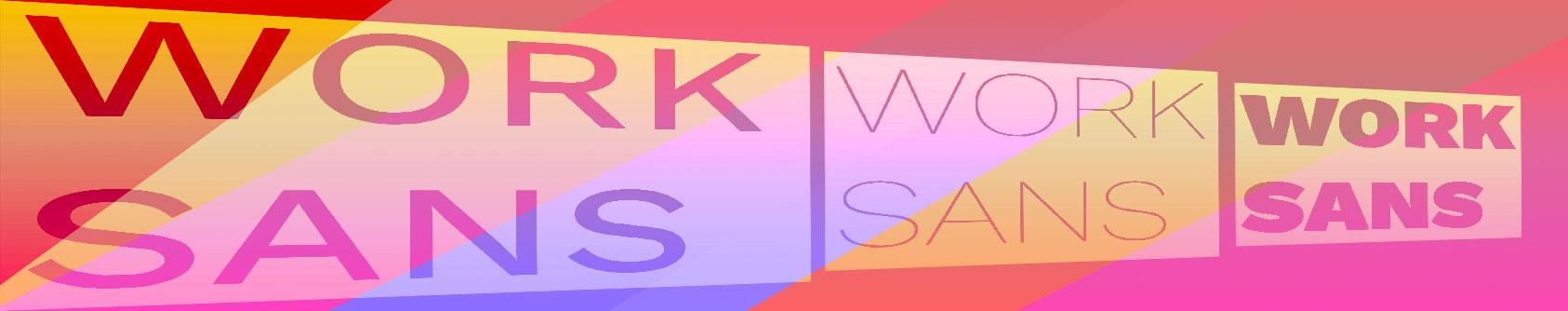
As far as free variable fonts go, Work Sans has a pretty good weight range. The 900 weight is fairly chunky and it's gree on Google Fonts so it's a good option.
With Work Sans the middle of the range weights are better for the medium sizes whereas the more extreme weights tend to be better for display. You certainly don't want to be using the very thin weights at a small size or it will be come pretty hard to read.
Get Work Sans - Free, Google Fonts
Newsreader
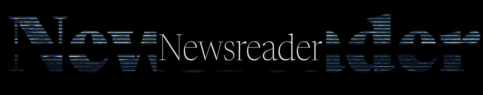
Newsreader, I guess as per the name, gives me newspaper vibes. The Serif fonts tend not to have an extensive weight range as the Sans fonts, but this one gives you a nice range, and I liked the sharp lines. From the weightier Serif variable fonts I've seen, they tend to lose that sharpness, but not this one!
Newsreader was designed with onscreen usage in mind, it is particularly good for your web projects. This is something that a lot of developers don't really consider, but it really does make a difference if a font was designed for screen over print. Trust me on this!
Get Newsreader - Open Source/Free