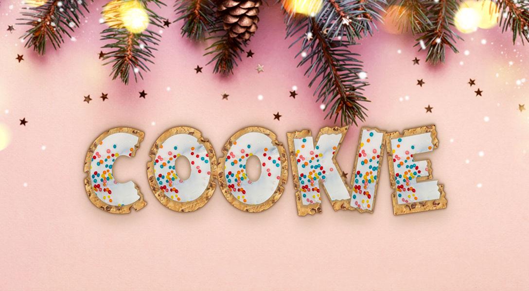
Cookie Effect layering with Variable Fonts
Creating layered text effects is easily accomplished with variable fonts without any of the performance drawbacks of loading multiple font files.
The Man This Monster by John Roshell is Paid
Code by Mandy Michael available on Codepen
You'll notice a lot of the examples I show are text effects, and with the holiday season around the corner I've got a few holiday themed effects to share that make the most of variable fonts.
I've been making text effects for a long time, and one of the biggest drawbacks was that if you wanted to layer different versions of the fonts for the effects you'd have to load multiple versions into the page, which is not great for your page performance. But with variable fonts you don't need to trade your cool effects for performance, because all the "layers" exist within the one font.
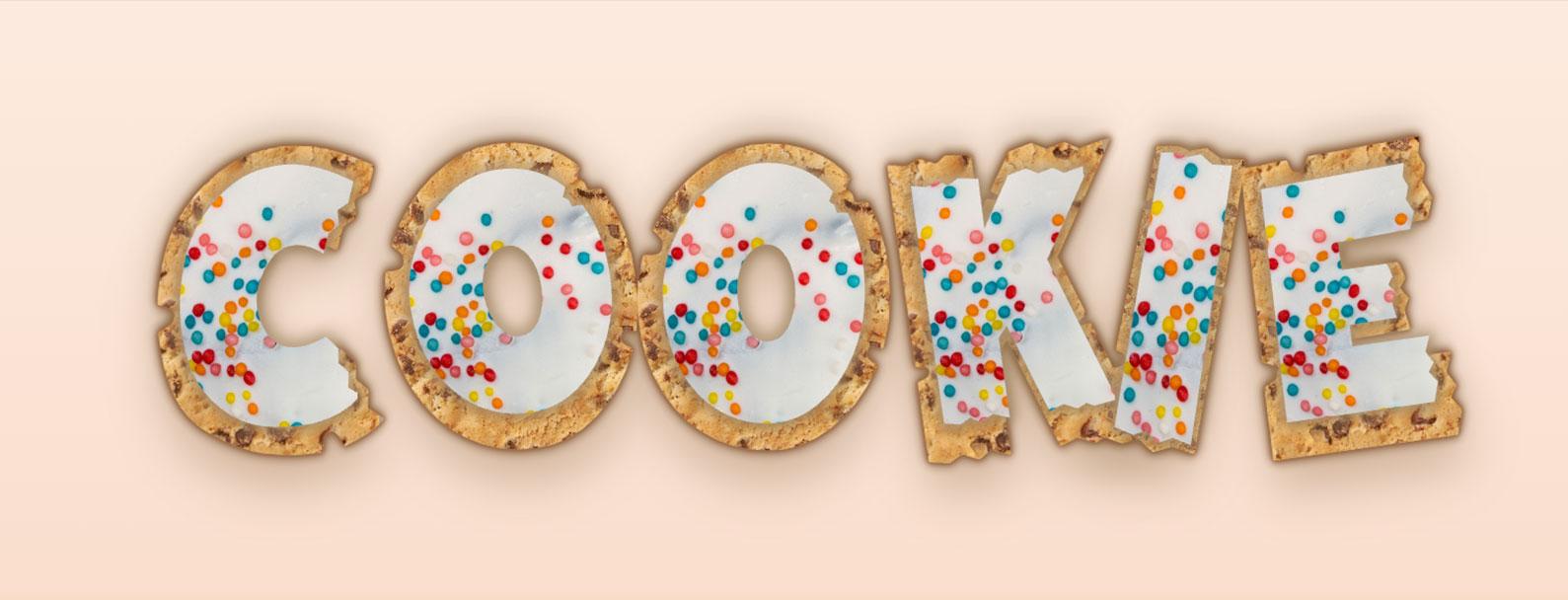
So for this example we'll be layering the font This Man This Monster and instead of having multiple slight different versions we'll adjust the variable font axis to give us the effects we want. There are two versions of this effect, the one below with more perfectly aligned text, and the simplified one. I will note that this font was not made to be layered. So it is a little tricky, we'll address that later.
For the purposes of this article we'll use the simplified one, the approach is very similar, just the version above uses the JS library splitting.js to split the characters out into individual spans so I could arrange them more accurately.
In order to accomplish the layering we'll need multiple versions of the text, I used to do this with pseudo-elements but unfortunately that has some accessibility drawbacks so instead we'll just wrap the text in a span and set aria-hidden to the extra ones so we don't get "cookie" reading out multiple times by the assistive tech. We will need three layers, which i'll get to a bit later on, it should look like the following html.
<h1 class="heading">
	<span class="cookie">cookie</span>
 	<span class="shadow" aria-hidden="true">cookie</span>
	<span class="icing icing-sprinkles" aria-hidden="true">cookie</span>
	<span class="icing icing-shadow" aria-hidden="true">cookie</span>
</h1>
We want to start off by setting our base text properties this include things like font size, font family etc. For this effect I wanted the cookie to look like it had some 'bites' taken out of it, so I am using a variable font called This Man This Monster which has a chew and bite axis, i've set these to my desired values using the font-variation-settings property. You will also need to set position: relative to ensure that we can align all the layers.
You'll notice I have a fixed pixel font size, unfortunately because this font is not made for layering it makes layering quite challenging. So for the purposes of this demo I've fixed the size. However You can check out an alternative demo at the end that creates a responsive version of this effect.
h1 {
	font-family: "This Man This Monster";
	font-variation-settings: "CHEW" 3, "BITE" 5;
    font-size: 215.82px;
	color: #bca082;
	position: relative;
    margin: 0;
}
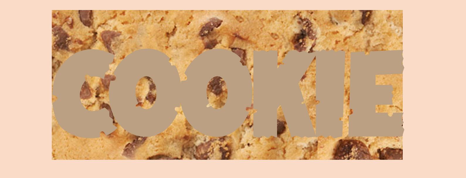
Now we set up the base cookie layer, I've used an image I have from iStock but you can use any kind of cookie texture you want here.
A staple in text effect creation is using a background-image in replace of a colour. Whether you repeat the image or set it to cover the whole text is up to you, it really depends on the image you decide to use, you might need to play around a bit to get it right. The same goes for the background-size and background-position, it will vary based off your image of choice. It's going to look like the image below, but that's ok we have some extra steps still.
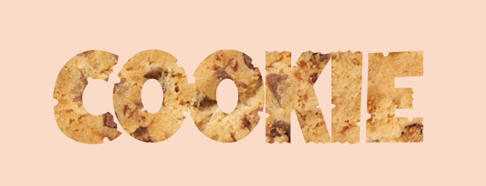
In order to have the background image be clipped to the text area only we want to set background-clip with a value of text and we also want to set the webkit-text-fill-color to transparent to hide the text color. This will reveal the background image we set (See image below).
Your CSS should look something like the following.
cookie {
	background-image: url("/link/to/image/cookie-texture.jpg");
	background-repeat: repeat;
    background-size: 200%;
    background-position: 0 0;

	background-clip: text;
	-webkit-text-fill-color: transparent;
}
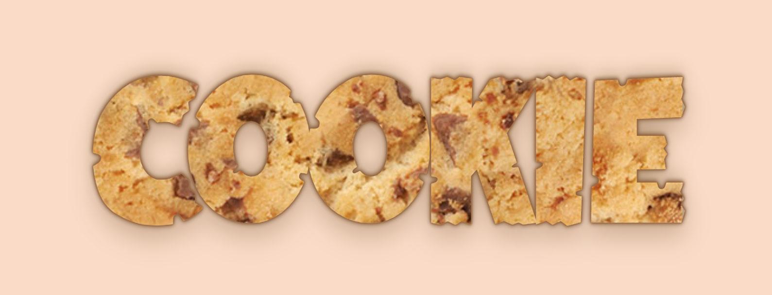
Although the effect looks like it's only 2 layers we need 3 to account for the text shadow. Text shadows sit behind the text colour, this means if we remove the color and replace it with a background the text shadow would be sitting on top of the background. To get around this we add the extra layer to make sure that our text shadow sits above the cookie texture.
.shadow {
	position: absolute;
	top: 0;
	left: 0;
	z-index: -1;
	text-shadow:
		0 1px 2px rgba(146, 97, 60, 0.3),
		0 -1px 2px rgba(146, 97, 60, 0.3),
		-1px 0px 2px rgba(146, 97, 60, 0.3),
		1px 0px 2px rgba(146, 97, 60, 0.3),
		0 1px 5px rgba(146, 97, 60, 0.3),
		0 -1px 5px rgba(146, 97, 60, 0.3),
		-1px 0px 5px rgba(146, 97, 60, 0.3),
		0px 0px 5px rgba(146, 97, 60, 0.3),
		0 15px 25px rgba(97, 59, 7, 0.3), 0 -3px 4px rgba(97, 59, 7, 0.3),
		0 -10px 15px rgba(#5a3e0a, 0.2), 0 3px 4px rgba(90, 66, 9, 0.11),
		0 0 5px rgba(56, 39, 22, 0.3), 0 20px 30px rgba(255, 237, 225, 0.2);
}
This looks a little confronting, but it's mostly that text shadow that makes things look a but complicated. With any new layers we need to position them to align with the original layer, to do this i've set it to position absolute and set that to the top left of the parent h1. We set a position: relative on the parent h1 so this will ensure the text sits in alignment with the original.
I've also set z-index of -1 on the text to make sure it sits below the original cookie text. This makes sure that the shadow is at the bottom. You must have a position set in order for this to work.
Finally that text shadow. You don't have to use this specific shadow, but basically i've layered shadows in order to create the look I want. Each like 0 1px 2px rgba(146, 97, 60, 0.3) sets an x and y position, a blur and a colour. The more I add the more shadows are included. For example, the first 4 lines simply create a 1px outline with a slight blur. You can play around with the text shadow to adjust how it looks. Understanding how text shadows work can really elevate your text effects.
Finally we have the icing! This is where it gets a little tricky depending on the font you are using. Unless a font is designed to be layered it can be quite difficult to get things to align, so here I start to get a little hacky.
First up we set up the base, which includes all the positioning like the previous layer. We are offsetting the left value here, that I will explain further down.
.icing {
    position: absolute;
    top: 0;
    left: -100px;
}
We then want to start adding the styles for styling the font itself. In order to access the chew and bite axis we use the font-variation-settings property again, but this time i'm setting bite to zero, because the icing isn't bitten into yet. I've added a filter with a very slight blur, this just softens the edges a bit, and finally the transform.
.icing {
	font-variation-settings: "CHEW" 3, "BITE" 0;
    filter: blur(0.2);
}
Next we need to create the actual texture. The first icing layer is going to add the icing texture. I have used an asset from iStock but you can use whatever you like. Much like the cookie example the background size properties will vary.
.icing-sprinkles {
	background-image: url(https://assets.codepen.io/209981/cookie-icing-compressed.jpg);
	background-size: 50%;
	background-clip: text;
	-webkit-text-fill-color: transparent;
}
At this point things probably don't align and it's likely looking something like the following image.
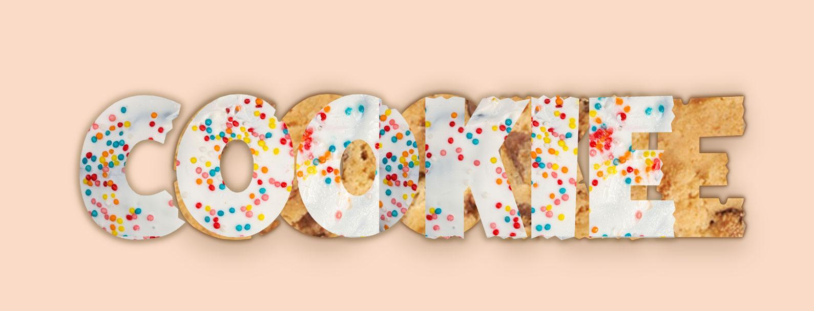
As this font was not designed to be layered I've had to use the transform and letter-spacing properties. With the scale in order to mush it in a bit to fit you'll need to modify the x and y axis separately, adjusting them equally will not work. The letter-spacing property will also require some finessing. I basically just adjusted until I was happy. I wasn't overly bothered about it being perfectly centred because cookies (at least the ones I make) never are. I just wanted it, good enough. I think the slight offset adds to the charm anyway.
.icing {
    transform: scale(0.735, 0.87);
    letter-spacing: 0.273ch;
}
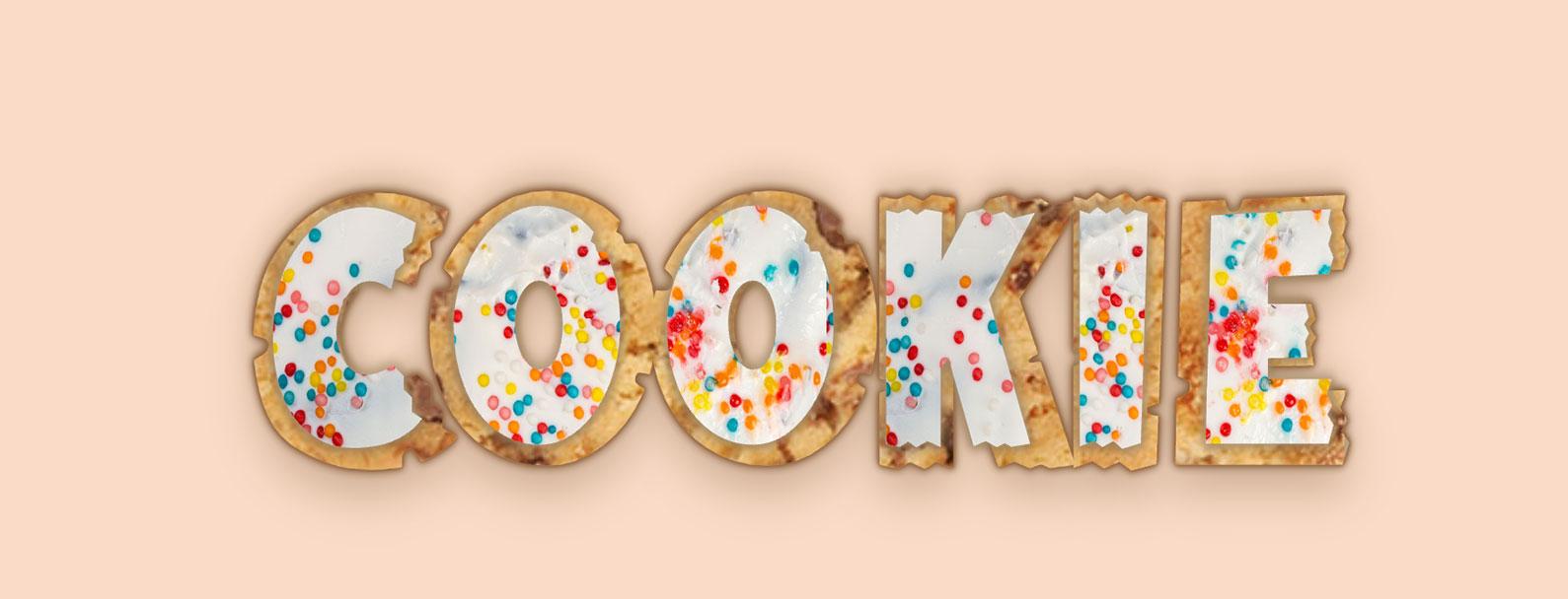
Finally we are going to add another shadow just to make the icing look less flat against the cookie, I've also added a slight blur, though questionable whether it's needed, I just felt it was. At this point the shadow will be sitting above the sprinkles, so we'll need to add a z-index to the sprinkles layer to make sure it sits on top.
.icing-shadow {
	text-shadow:
		1px 1px 2px #5c3f12,
		-1px 1px 2px #5c3f12,
		1px 1px 2px #bdaa8b,
		-1px 1px 3px #bdaa8b,
		1px -1px 3px #bdaa8b,
		-1px -1px 3px #bdaa8b,
		2px 2px 4px rgba(120,89,40,0.4),
		-2px 2px 4px rgba(120,89,40,0.4),
		2px -2px 4px rgba(120,89,40,0.4),
		-2px -2px 4px rgba(120,89,40,0.4);
	filter:blur(3px);
}

.icing-sprinkles {
    z-index: 1;
}
This will leave you with something like the following image! You can play around with this however you want.
If you want something a bit more controlled with more perfectly aligned icing (in the end I had to have it as it turns out I was not happy with the misalignment), then you need more specific control over each letter. I accomplished this with Splitting JS library. You could manually split each letter up, but I wanted the text to be easily editable so this was quicker.
I mentioned at the start of the post that the version in the post was not responsive. The demo which uses splitting.js is responsive! So if you would like a more responsive version, and the benefit of better alignments you can check out the Codepen of responsive cookie text.