Performance benefits of Variable Fonts
Wondering how variable fonts perform in comparison to regular fonts. Let's do a dive into the pros, cons and possible future

When we think about web fonts and their impact on the performance on our websites we often focus on three main areas:
- The number of font requests
- Font file size
- Time to first render
I wanted to see how variable fonts fared in these situations and did a review comparing with standard fonts. Here are my results.
Reducing the number of requests
This can be accomplished several ways including caching, CDNs and reducing the number of style variations. I’m not going to get into the use of CDN’s or caching because it’s essentially the same process for standard fonts as it is for variable fonts. Instead, I will focus on reducing style variations.
In a world of standard fonts, reducing the number of styles reduces the number of requests because it results in fewer files and therefore fewer requests. Typically this meant that we’d have to plan our typography choices and weigh up the cost of design over the cost of performance and decide whether the cost of additional styles is worth the impact to performance.
With variable fonts, because they can contain multiple variations in the one file — this means we have immediately reduced the number of requests without having to question our designers about their typography choices.
Variable fonts, in essence, reduce the number of requests simply by being a variable font. But if the font has all the information in it, what does that do to file size?
Reducing the font file size
This can be achieved several ways, the first step is usually choosing the most efficient Webfont format like WOFF2 for example.
Setting a baseline
I conducted a review of different font file sizes specifically using Source Sans Pro by Adobe because it’s open source and on Github.
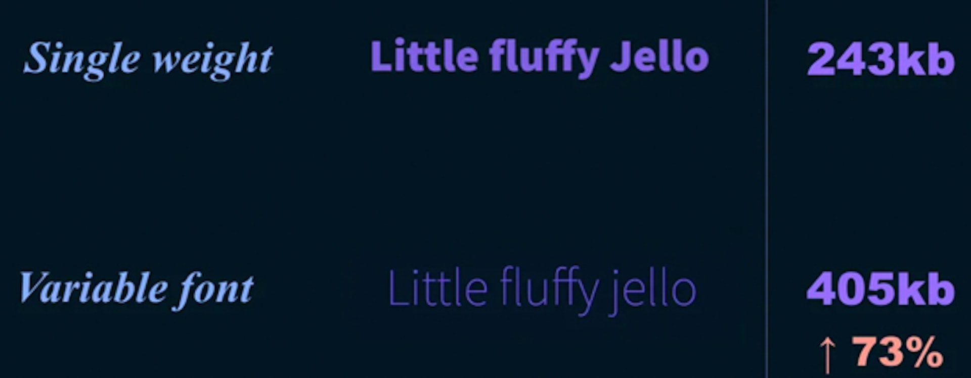
As a baseline, a single weight of the standard version of the font Source Sans Pro is approximately 243kb in OTF format and the size of the variable font in OTF format is 405kb. This makes the variable font 73% larger than a single weight of the standard Source Sans Pro font.
But given that the variable font contains all the information for all the font weights the resulting combined file size of all the standard Source Sans Pro weights is approximately 1170kb.
That is nearly 3 times the size of the variable font.
Even if you just wanted the bold and regular versions of the font, two versions are still larger than the single variable font.
OTF vs WOFF2
OTF file sizes, however, are pretty large in comparison to the font compression you get from formats like WOFF and WOFF2.
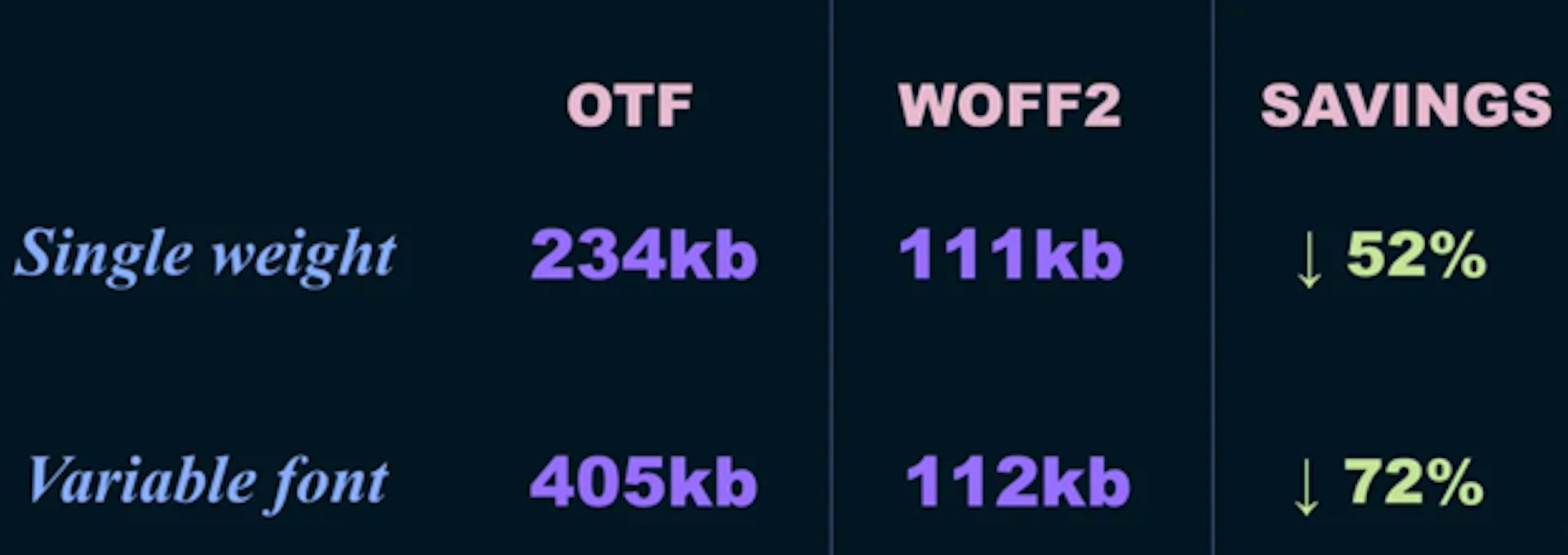
So in comparison, we can gain significant reductions in file size by simply using WOFF2 versions of the fonts.
What I did find interesting was how significant the savings were in the variable font. Dropping from 405kb down to 112kb, making it almost the same size as a single weight of Source Sans Pro (standard font).
This took me a bit by surprise and I’m pretty confident saying this won’t be the case in all scenarios. But it’s pretty great to see how effective the WOFF2 compression can be on a variable font.
Reducing file size by subsetting
With standard fonts, another way to reduce file size is by subsetting the font to remove unnecessary characters or reducing it to a specific language set like only Latin characters.
This comes with some risks and can result in parts of your typography rendering as your fallback and not your font if you accidentally remove characters you need.
You can subset fonts with tools like Glyphanger, by filament group, they have a great readme on the Github page and it works with both standard fonts and variable fonts.
I ran a Glyphhanger over the standard and variable versions of Source Sans variable and subset it to uppercase and lowercase English characters, numbers and special characters like exclamation marks.
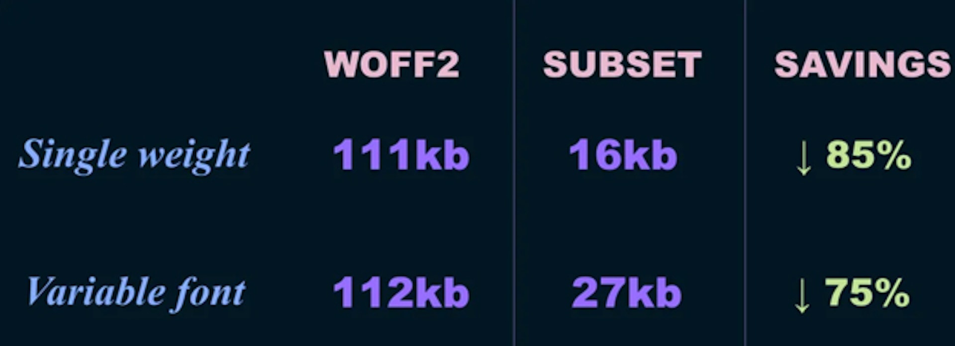
This reduced the file size of the Single weight from 111kb down to 16kb (85% savings, nice). The variable font dropped from 112kb down to 27kb (75% savings, acceptable!).
Again, I was pretty surprised by this. I was expecting Source Sans Variable to be larger than this. Keeping in mind we typically use both a bold and regular version of a font a single variable font at 27kb is still smaller than two weights in the standard font. So that is a pretty great saving.
It’s important to note at this point though that this is just my experience with Source Sans, it will vary between fonts and you may find your outcome is worse than using standard fonts. So don’t just jump in blindly, make sure you test and compare and do what is best for your project.
Additional file size considerations
Some additional things to consider about file size — a single larger font file will take longer to load than multiple smaller font files.
With standard fonts because individually they are typically a smaller file size you might have your body text render quicker and then the bold text load, and so on. The benefit here is that because, individually, the files are smaller you may get your content sooner.
With variable fonts you have to wait for the single file to load before any text is rendered — this can result in a longer delay. However, having to wait for all the font data to download before rendering the text avoids the problem where part of our text might load and affect the message while we wait for other font versions to load in. Also, because we only load the fonts in once, we are not forcing the page to re-redraw every time a new font is loaded.
So when it comes to file size, the verdict on variable fonts is, “it depends”, because it is going to depend on your site, your requirements and the fonts you are using.
Reducing time to first render
So finally let’s look at reducing the time to first render. This has an obvious performance benefit because it’s in the name, and as I just explained the larger single file can take slightly longer to load than an individual standard font. So even a short delay with a Flash of Invisible Text can make the user feel like a page is loading slower than it is. As a result, and in my opinion, we should aim for a Flash of Unstyled Text instead of a Flash of Invisible Text.
Flash of Invisible Text (FOIT)

The “Flash of Invisible Text” is when we block or delay the font from loading until it’s available. So our page can look very empty until the fonts have loaded in.
Flash of Unstyled Text (FOUT)

Flash of Unstyled Text (FOUT) is when we load a fallback font and switch or swap to our custom fonts when they are ready.
In my opinion, a flash of unstyled text is a better experience than not being able to read your content at all — so what we want to be able to do is embrace FOUT but try and limit the impacts as much as we can.
A simple way to embrace FOUT is by using the font-display property with the value of “swap” — this will render our fallback font defined in our font stack and then swap in the custom font when it has loaded. There are other options for font-display, which I recommend you investigate, but for FOUT, swap is a good place to start.
font-display: swap;
One of the issues with FOUT is that as the fonts swap, we often see the layout shifts to accommodate for the different “sized” fonts.
With Standard Fonts we can modify the line-height, size and letter-spacing to try and match our system and custom fonts to reduce that layout shifting. We can do this with a fantastic tool called Font Style Matcher, built by Monica Dinculescu, inspired by a fantastic blog post by Helen Holmes called Type is Your Right (seriously great article go read it).
What I’m hoping to see is as variable fonts become more widely supported across Operating Systems we can reduce this layout shifting by using a variable system font as a fallback in our font stack.
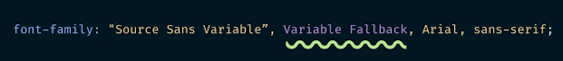
Imagine if we had system fonts with the ability to control for weight, width and optical size — we would be able to modify the font itself to match the size, and the space it takes up, much more closely with our custom fonts. Combining with the existing techniques of line-height, font size etc, we could create an incredibly smooth transition between the two fonts meaning less noticeable FOUT and less redraw due to less layout shifting.
This would be incredible, and I hope we get to this at some point.
TL;DR Variable Font Performance
Variable fonts reduce the overall combined file size and automatically reduce the number of network requests by simply being a variable font.
Even if you consider the slightly larger file sizes, when combined with improved font compression formats like WOFF2, font subsetting and font loading techniques like font-display: swap; we end up in a situation where we can still get smaller overall font file sizes as well as a significant increase in stylistic opportunity.
If we can improve some of our pre-existing technical problems around performance we can start to shift our focus. We no longer need to trade-off design for performance.
It becomes an opportunity to figure out how we can use this technology to create better experiences for our users. Variable fonts offer so much variation, this means we can create experiences which better suit our devices, and environments, and adjust our fonts to create more accessible and legible text, without being concerned about how the increase in the number of styles is going to blow out our page size.