Variable fonts for text effects
What drew me to variable fonts to start with was the weird and wonderful nature of the designs, these are my favourites
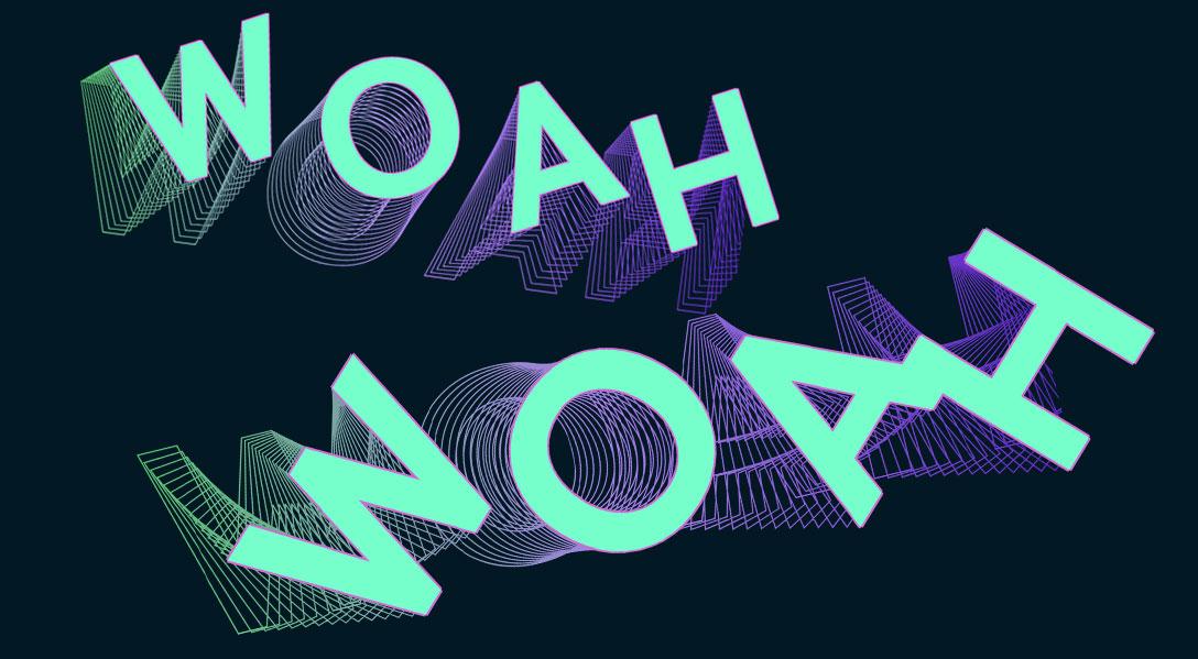
Woah by Scribble Tone is Paid/Commercial
Decovar

Decovar was the first variable font I ever used, it was the first variable font to get me excited about variable fonts, and it remains one of the most versatile and useful fonts for making effects and doing weird stuff with.
It features a large number of axis that you can combine, layer, and tweak to get the perfect style. It's really worth checking out.
There is a great article about Decovar back in 2016, if you're interested in the history it's worth a read.
Woah
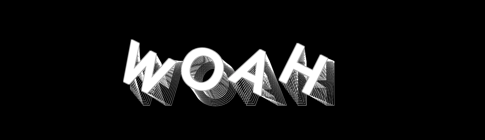
As it's name suggests this font is pretty amazing. If you are looking to do something to make people go "oh my gosh that is so cool" this is the one for you.
Personally I think it looks like a slinky, and there is all sorts of cool things you can do with it. One of the ways I like to use it is with the users mouse movement. It's the perfect way to showcase how incredible this font is (at least in my opinion).
I've made a demo on Codepen using an older version of this font, the newer version has more axis options and renders a bit better on smaller screens so make sure to get the latest!
Cheee
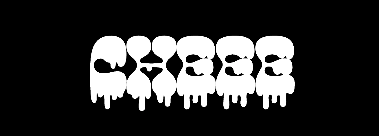
If you have checked out any of my other posts you might recognise this font because I use it quite a lot in my demos. What I really like about this font is that it can be used to create a number of completely different effects. I've used it for slime, snow globes, underwater, audio effects. It really is very versatile.
What I think makes it suitable for my this list of weird variable fonts is by far the drip axis. The obvious use case would be blood, but I like to be a bit different and instead I made slime.
Schijn

Typearture, in my opinion, make some of the most incredible fonts you will find. What I love about them is they push the boundaries of what is considered a font. There is no shying away from creating something, fun, interesting and cool.
Schijn was one of the first fonts I'd seen created by Typearture and I loved it so much I used it as the title font of this very site for it's first 2 years of life. It's created to look like gemstones, and there is a lot you can do with that.
If you just want some inspiration the Variable font showcase on the Typearture website is absolutely incredible, definitely check it out.